


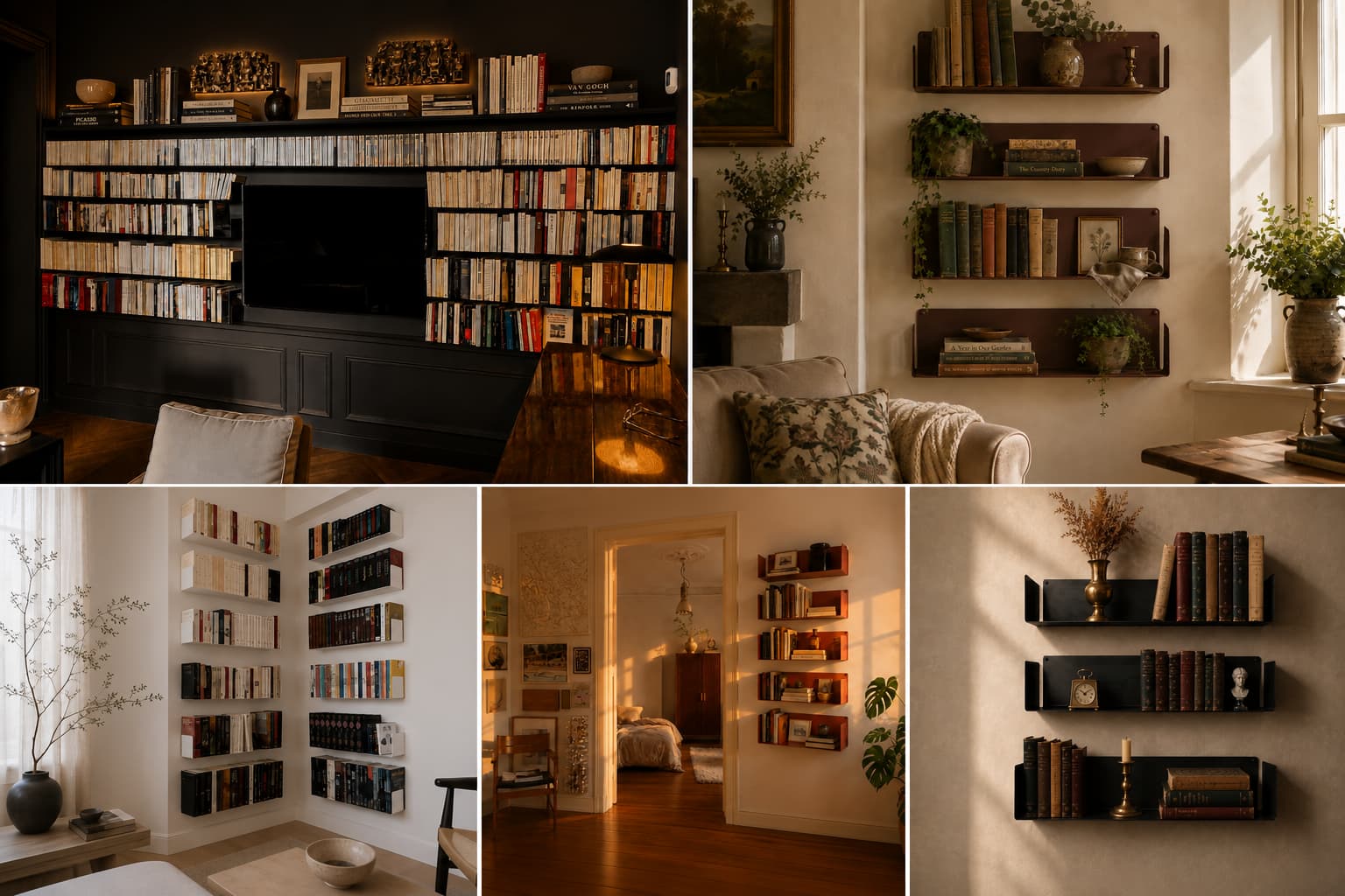
Personalised decor searches climbed 313% over the past year, and the most photographed shelves of 2026 belong to homes that look read, lived in, and unapologetically themselves. Five aesthetics have settled into the conversation, each with its own origin story, palette and rituals, and a particular kind of reader who recognises themselves in it. Below are the five, decoded one by one, with the one that probably already half-exists on your walls usually surfacing by the end.
The year your shelves became the room’s voice

The big shift of 2026 isn’t a colour or a material, it’s a posture. Interior magazines and Pinterest moodboards have spent two years pushing rooms that feel curated rather than staged, and bookshelves prove that intention at a glance. Where a sofa says comfort and a rug says taste, a bookshelf tells a small autobiography: what you read, what you keep, what objects you grew up around.
That’s why five distinct aesthetics now coexist instead of one winning trend, each one a different answer to the same question: how do you want your room to introduce you? Some are dense and bookish, others spare and tactile, a few openly romantic. The wall-mounted format makes them all faster to attempt: no joinery, no fixed footprint, and two screws per shelf that let you repaint your idea every six months.
Bookshelf wealth: the curated reader’s manifesto

San Diego studio House of Hive Design Co. coined the term in late 2023, and a single TikTok primer from co-founder Kailee Blalock crossed 1.3 million views and seeded the #bookshelfwealth tag past 3.8 billion. The aesthetic stuck because it gave a name to something interior designers had been quietly building for years: rooms whose visual richness comes from actual reading, not from props.
Density without chaos is the whole game: books fill most of the shelves, paperbacks and hardbacks mixed, dust jackets often kept on. Art layers in front of the spines, with small framed pieces leaning on the shelves themselves and larger ones hanging from the front edge. Vintage objects sit between stacks, with a brass desk lamp, a ceramic dish from a flea market, or a postcard slid into a frame doing the work. The palette runs warm: oak shelves or matte steel in a deep shade, with a single warm-temperature lamp instead of overhead light. The 2026 evolution most often cited by interior magazines is the ‘library wrap’, a maximalist extension where the same books and steel shelves run along three walls of a room rather than one.
To recreate it on wall-mounted shelves, lean into asymmetry:
- Run shelves at slightly varied lengths instead of a perfect grid, so the eye stops on the books rather than the structure.
- Stack books in odd numbers on each shelf, alternating verticals with two or three horizontal piles topped by a small object.
- Lean a piece of framed art directly in front of a row of spines, covering them partly. Counterintuitive, but it’s the signature move.
- Keep one warm pool of light at shelf height, never from the ceiling.
This look is for the reader who already owns more books than display space, the kind of person who annotates margins and re-reads. If your bookshelf already looks half-right before you start decorating, you’re closer than you think.
Dark academia: the moody library look

Dark academia traces back to a Tumblr tag from 2014-2015 organised around Donna Tartt’s 1992 novel The Secret History, its New England liberal arts setting, its classics students, its decadent moodboards. The aesthetic migrated to Pinterest and Instagram, exploded during the 2020 lockdowns, and matured into a permanent home decor language by 2026.
Imagine the inside of an old college library reimagined for a modern flat, with deep walls (forest green, oxblood, charcoal, or saturated navy) and shelves in matte black or stained dark walnut. Books face spine-out with their gold lettering catching the light, often with dust jackets removed to reveal the cloth underneath. The accent vocabulary is brass (candlesticks, picture lights, small frames), leather (a single chair or a journal cover), and antique paper (a print, a map, a botanical sketch). Lighting stays low, one warm pool at most, never overhead.
To recreate it on a single wall, pair black shelves with a wall painted in deep botanical green or oxblood. Choose hardback editions where possible, with Folio Society reissues, Penguin Clothbound classics and anything with cloth and gold lettering working hardest. Slide a brass picture light above the top shelf rather than relying on the room’s main fixture. Add one or two objects with weight: a marble bust, a vintage globe, a stack of leather notebooks. Resist the urge to crowd, since the look needs negative space between the dense moments.
This aesthetic is for the literature graduate who never quite left the campus library, the late-night essayist, the candle-and-Earl-Grey crowd. If you own three different versions of the same Shakespeare and you light a fire before you write, this is your room.
Cottagecore: the floral library nook

Cottagecore was first named on Tumblr in 2018 around an idealised vision of rural English and Northern European pastoral life: bread baking, foraging, dried flowers, hand-knitted everything. Tumblr posts on the theme rose 150% during the spring 2020 lockdown, the aesthetic crossed into mainstream interiors by 2022, and a moodier evolution has taken hold in 2026 with darker greens, heavier florals, and a noticeable drop in sugar.
Gentle and lightly nostalgic, the look favours shelves in white, cream, sage or muted dusty rose. Books mix with dried flowers in small ceramic jugs, vintage children’s hardbacks (the kind with faded cloth spines), a single brass candleholder, and eucalyptus stems hung at the side. Floral wallpaper or fabric often backs the shelves themselves, with peel-and-stick paper acting as the 2026 shortcut that made this style finally rentable. Daylight matters more than evening light, and the corner photographs best in pale morning sun.
To recreate it on wall-mounted shelves, start with white shelves and back the wall behind them with a small-print floral paper. Mix paperbacks with thrifted hardbacks, since second-hand bookshops tend to be generous on old Penguin orange spines and faded cloth covers. Group books in small piles separated by ceramic cups holding a stem or two of dried lavender. Add one piece of handmade pottery per shelf, and a single fairy-light string if the corner is dim.
This style is for the slow-living convert, the herbalist-curious, the reader whose paperback collection runs to Tove Jansson and Mary Oliver. If you already buy bread from the same bakery every Saturday and your kitchen smells of rosemary, you’re closer than you think.
Japandi: the calm-shelf approach

Japandi is the portmanteau of Japanese minimalism and Scandinavian warmth, named around 2017 in design press and matured by 2026 into one of the most photographed interior languages on Pinterest. It draws on wabi-sabi (the Japanese acceptance of imperfection) and hygge (Danish cosiness), pulling the warmth from one tradition and the discipline from the other.
Sparse without being cold, japandi works with shelves in oak, ash or natural-tone metal, spaced generously apart. Books are arranged loosely, never crammed, with ten to twelve per metre of shelf, dust jackets often removed if the underlying covers are quieter, or turned around so only the cream pages face out. Objects are few and chosen: a single ceramic vase with a kintsugi crack, a small wooden tray, an ikebana arrangement of one branch. Walls stay pale (chalk white, linen, soft greige), and the room reads as if someone exhaled into it.
A few rules make the difference between true japandi and a generic minimalist shelf:
- Leave at least 30% of each shelf empty. Negative space is the point, not a side effect.
- Limit colours to a tight neutral palette of oak, white, charcoal and terracotta. Anything jewel-toned breaks the spell.
- Choose one ceramic object per shelf, never three. Mass kills the calm.
To recreate the look on wall-mounted shelves, install natural-tone or matte black floating shelves at wide intervals (50 to 60 cm vertical spacing works well), arrange around ten books per shelf, and rest a single object at the end of each row: a smooth river stone, a wabi-sabi bowl, a brushed-brass candleholder. The invisible-bracket format helps here, since visible L-brackets clutter the line that the whole style depends on.
This look is for the apartment dweller chasing calm, the meditation-app subscriber, anyone who finds visual noise tiring. If your favourite room is the one you stand in to brush your teeth because it’s the quietest, japandi is your match.
Mid-century modern: the warm-wood classic

Mid-century modern refers to the design movement that ran roughly from 1945 to 1965, anchored in post-war optimism, new industrial materials and architects like Charles and Ray Eames, Arne Jacobsen and George Nelson. The revival started around 2010, gathered force during the Mad Men years, and never really left. In 2026 it’s no longer treated as a trend but as a permanent vocabulary that interior magazines keep returning to.
Warm, geometric and confident, the look runs on wood tones from honey to dark walnut, often paired with brushed brass or powder-coated steel in mustard, rust or burnt orange. Shelving forms stay clean, with tapered uprights on floor units and single horizontal lines on wall-mounted versions. Books mix with sculptural ceramics, framed botanical or graphic prints, a single brass clock, or an Eames-era reissue object. The palette around them sits in warm neutrals (cream, oat, taupe) punctuated by one saturated accent.
To recreate the look on wall-mounted shelves without buying a full vintage cabinet, choose shelves in a colour that echoes the era. Rust color shelves read mid-century immediately, particularly against an oat or sage wall. Arrange books in groups separated by small ceramic vases in coordinated tones, lean a graphic print at the end of one shelf, and add a brass picture light pointed downward. Resist the urge to add greenery in plastic pots: one tall snake plant in a ceramic vessel does more work than three smaller pots.
This aesthetic is for the design enthusiast who watches Mad Men reruns and quietly loves a clean line, the architect-adjacent, the reader whose favourite shop sells Don Draper-era reissues. If you’ve ever paused on a brass lamp in a window and considered the price, you’re already half-way there.
Picking the aesthetic that suits your room (and you)

The five styles overlap more than the moodboards admit. A few quick prompts cut through the noise:
- If your favourite room is dark with one warm lamp, lean dark academia or bookshelf wealth.
- If you struggle to keep clutter at bay, lean japandi. It forgives less but rewards more.
- If you keep dried flowers around even when nothing’s an occasion, lean cottagecore.
- If you’d describe your taste as ‘warm but quiet’, lean mid-century or japandi.
- If your books outnumber your decor objects three to one, lean bookshelf wealth.
The single fastest lever is the colour of the shelf itself. Matte black anchors moody looks (dark academia, bookshelf wealth on dark walls). Crisp white opens cottagecore and softens japandi. Rust shifts a room straight into mid-century. The wall stays the same, the books stay the same, and the shelf does the work. Made-in-Italy steel shelves come in eight shades for that reason, so the foundation can change without buying new furniture.
From moodboard to wall

By next weekend the wall could be up: shelves chosen, books from the spare room moved in, the two objects you actually want on display kept and the rest packed away. The aesthetic you choose matters less than the fact that you chose it consciously, and that’s the 2026 shift in one sentence. Whatever style turns up on your wall, the shelf underneath is the foundation everything else leans on.
FAQ
Are these 2026 trends actually new, or are they recycled?
Cottagecore and dark academia have been visible online for nearly a decade, and mid-century modern for over seventy years. What’s new in 2026 is the way they’ve all been rehoused around the idea of personal, lived-in shelves rather than aspirational empty rooms. The frame changed, not the styles.
Can I mix two aesthetics on the same wall?
Most working combinations pair a moody style with a calmer one, like japandi shelves in a dark academia room, or cottagecore objects on mid-century shelves. The rule is to pick one structural style (the shelves and the wall) and one styling style (the objects on top). Doubling up on both makes the wall feel costumed.
Do I need built-in shelves to achieve these looks?
None of the five styles depend on joinery. Wall-mounted floating shelves achieve every aesthetic listed above, often more flexibly, because you can adjust spacing, swap colours and move them when you redecorate.
How many books per shelf for the bookshelf wealth look?
Aim for around 70-80% fill. Five hardbacks weigh roughly 2-3 kg and five paperbacks around 1 kg, so a 60 cm shelf comfortably holds 12 to 15 books without strain. Leave the last fifth open for an object or a leaned frame.
Which aesthetic ages best?
Mid-century modern has the longest track record (decades) and japandi is on the same trajectory. Dark academia and cottagecore are more emotionally driven and may shift in five to seven years. Bookshelf wealth is less a style than a posture, so it survives the underlying decoration changing.